Use this to add songs to the Volumio queue without playing them instantly.
As you might have derived from the last posts I have become a fan of Volumio recently. However, one thing that I thought was implemented incorrectly (from my very very personal point of view) is how tracks are handled when they are added to the playing queue.
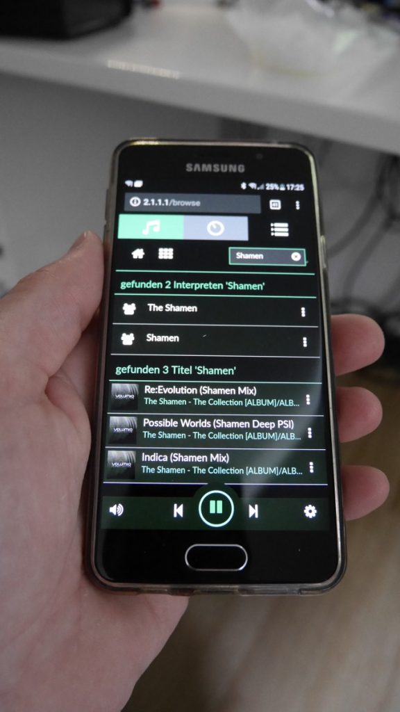
The image shows the results of the search for a track. Volumio is running on a Raspberry PI somewhere in my home network. The user interface is accessed with the browser of my current mobile phone. Clicking a track in the list of results will add that track to the active queue (which is good) AND will instantly play it regardless of what’s been playing at that moment (which is bad – insanely bad).

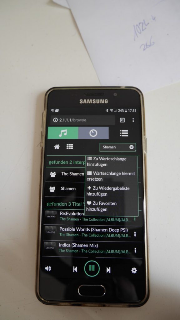
You can, however, control that behaviour by using the track’s contextmenu which is accessible via the dotted icon on the right. This might be an okay solution when the interface is shown on a larger screen or when you operate it with a precise pointing-device (computermouse, stylus, …). In what I would describe a real-world-scenario – operating the userinterface via a small touchscreen-device- this turned out to be vastly annoying. Even when being completely focused I did not manage to add more than two or three tracks to the queue without accidentally playing one of them instantly.
The first scenario where I would use Volumio was for playing music in our camp on a festival which we regularly visit with a group of friends. It’s unrealistic to think that it would work there without causing massive unhappyness: Multiple persons with different mobile phones, different … natural abilities to precisely use their hands… Some of my friends don’t work in IT but have “real jobs”. One of them is a carpenter with vicelike hands … add that and lots of alcohol over the course of a few days and … you might get the idea.
A perfect UI’s behaviour from my point of view would be where you click a track and it is simply added to the active queue – nothing more. The actively playing track just keeps on playing. If its end is reached the next track in the queue will be played. For those still in control of their fingers and completely focused on the task (see above) the contextmenu provides possibilities to do some finetuning.

After messing around with the ui’s sourcecode I fortunately found a post by Mark Wheeler where he describes how to change the ui’s behaviour excatly the way I wanted it to be. After setting up the environment for building my own version of Volumio’s ui (look here on how to achieve this) I implemented his changes into the code and … voila! (That’s all to it: It simply works.)
To be honest: I only did the absolute minimum change: in /src/app/browse/browse.controller.js I changed line 68 from
this.play(item)
to
this.playQueueService.add(item)
. That’s all. The ui now works exactly like I want it to. I might do some more stripping-down of it later but for now I’ll just leave it there. For those of you who want to use it but don’t want to set up the proper environment I provide the compiled version of the ui for Volumio Version 2.389 with the above mentioned changes. You can download it here. Extract and copy the folder ‘www’ to /volumio/http/ (obviously, you want to make a backup of your installation’s ‘www’-folder, first). Restart Volumio and you should be good to go.
Update for 2024:
https://community.volumio.com/t/how-to-tap-to-add-revised/61411


I’m struggling here…
where do you locate this file in the latest build of volumio?
/src/app/browse/browse.controller.js
thanks
Ian
sry, no idea, either